Distriktssköterska Höganäs
Om Palliativ Vård - Vad det är och hur det kan utföras i Höganäs kommun?
Urvattnad och korrupt äldreomsorg i Höganäs?
Ta del av faktabaserad och verklighetesbaserad information som är relaterad till hemtjänst i Höganäs 2024 .....
Höganäs hemtjänst och medicinering
Gått på magkänslan som vi pratade om på sjukhuset dvs att INTE välja att bli vårdad av Höganäs Omsorg AB.....
Ska du anlita hemtjänst i Höganäs? Läs detta först!
16 kända fall där sjuksköterskor i USA och Europa under perioden 1997 tom 2009 har tagit livet av sina patienter....
Hemsjukvård i Höganäs
*Sambandet med de fatala omvårdnads händelserna som min far var utsatt för....Turin - Spreadsheet marketing - SEO Technique [Karl-Johan Gyllenstorm]
- Dettagli
- Categoria: Digital Marketing
- By Karl-Johan Gyllenstorm
- Visite: 1856
Digital Marketing - Layout in a Google Spreadsheet
In the previous article, a concrete picture was given of how a layout in a Google Spreadsheet could be designed to market a software on the internet.
The structure of the layout has a certain system that is created to capture the attention of the audience as well as to achieve one or more purposes.
The layout can be divided into different sections. In each section there is input value that fulfills one or more purposes from a digital marketing perspective. A section = A cell in a Google spreadsheet.
Section 1:
Contains a well-chosen name (header 1) of what is to be highlighted in the eyes of the audience.
Often a selected name that is compiled based on thorough keyword analysis. (Header 2) a shorter description of the service/product that is well weighed and balanced. (Header 3) text that should motivate the audience to read on and to want to know more. (Header 4) Text information that should reflect "trust" in the eyes of the audience. Information that should make the audience safe. (Header 5) Motivator - Text that triggers and motivates the audience to want to know more or to use/ try the concept. (Header 6) Text that reflects duration and professionalism.
Section one is based on creating "trust" and on triggering the audience to read more about what is to be marketed.
Section 2:
Contains various functions. The functions are the substance of what is marketed. The substance is developed based on a needs analysis and demand. The substance acts as a motivator and trigger. The aim is to make the audience hungry, to make the audience want to know more about what is being marketed.
Section 3:
Contains benefits. Advantages, functions that the product, service. This is part of the experience that the user can take part in if he/she chooses to use the product, the service. The purpose of these parameters is to build trust with the audience and at the same time trigger the audience to click on one of the 2 buttons in section 4.
Section 4:
When the audience has read information up to this section, they have been influenced by the information more or less. Here we want to create the opportunity to capture the audience that is most hungry and that has decided that "this is something for me" - "I want this now". And to pressure the audience to make decisions quickly, a concise text in a red frame has been added below the 2 buttons. The information in the red frame tells the audience that some kind of time limit exists and that the product, the service, is compatible with major brands such as...Section 4 purpose is to hurry up, create an opportunity for decision/ruling.
Section 5:
Banner that is linked to videos that contain information that should convince/influence the audience to start using the product, service.. Video Information that will build "trust" with the audience.
Section 6:
Contains information that answers common public indirect questions about the product, the service.. The purpose of the information is to convince, influence, clarify, highlight advantages, opportunities with the product, service.. Which should build "trust" with the audience.
Section 7:
Information that should motivate and convince the audience to start using the product, service. "Triggers" that create trust with the audience. Can be made by interweaving other components within the framework of the same topic.
Section 8:
Break point for determination. Audiences who feel that this is what I want and that this is what I have been looking for get the opportunity to pick up the substance. By download link, check out, email, registration etc.
Section 9:
Information that gives the audience a picture of the development around the product, the service.. Information that should build "trust", convince, influence the audience to start using or to want to know more about the product, service.
Section 10:
A showcase/ demo that will convince the audience, show the audience how good the product, service is. Advantages and functions that the product, service has and that the audience can take part in if they start using the product, service. The storefront should make the audience feel that "this is something for me" or that "I want to know more about this", "this seems interesting and has potential".
Section 11:
An in-depth look at the product, the service showcase/ demo. *Which will convince the audience, show the audience how good the product, service is. Advantages and functions that the product, service has and that the audience can take part in if they start using the product, service. The storefront should make the audience feel that "this is something for me" or that "I want to know more about this", "this seems interesting and has potential".
Section 12:
Trigger/ added value that comes with the product, service. This information should convince/ influence the audience to start using the concept. The information must arouse interest in the audience, the information must be exceptional, unique!
Section 13:
New breaking point for decisions. The public gets the opportunity to download/ start using the product, service by clicking on one of the 2 buttons that could lead to a check out, download link, e-mail registration, etc.
Section 14:
Information about functional elements in the product, the service. The purpose of the information - to build "trust" with the audience.
Section 15:
Information about functional elements in the product, the service. The purpose of the information - to build "trust" with the audience.
Section 16:
Information about functional elements in the product, the service. The purpose of the information - to build "trust" with the audience and to arouse curiosity in the audience.
Section 17:
Image of the product, the service. Image that should reflect professionalism within the framework of the current niche.
Section 18:
New breaking point for decisions. The public gets the opportunity to download/start using the product, service by clicking on one of the 2 buttons that could lead to a check out, download link, e-mail registration, etc.
Section 19:
Questions and answers about the product, the service. The purpose of the section is to convince the audience that "this is good", "this is what you have been looking for" by answering questions and uncertainties about the product, the service.
Section 20:
Triggers that will trigger decision-making in the audience. Triggers that will motivate the audience to choose the product, the service. To provide the audience with indicative information that will create "trust".
Section 21:
New breaking point for decisions. The public gets the opportunity to download/start using the product, service by clicking on one of the 2 buttons that could lead to a check out, download link, e-mail registration, etc.
Section 22:
Storefront/demo layout of the product/ service that should give the audience an overall picture of what the product, or service looks like live. Here, colorful colors can be used in suitable combinations to trigger the audience (color psychology). Purpose: to build "trust" and to trigger the audience.
Section 23:
Detailed information that is indicative. Information that should create curiosity in the audience and at the same time convince the audience that this is really good, I want this, I want to try this (because?).
Section 24:
New breaking point for decisions and decisions. The public gets the opportunity to download/start using the product, or service by clicking on one of the 2 buttons that could lead to a check out, download link, e-mail registration, etc.
Section 25:
Image that affects the audience positively. Image that reflects energy, joy, success. The picture should get the audience in the right "mode" - the audience should feel joy when they look at the picture
Section 26:
Information that will push the audience to decisiveness, decision-making. Information that says there are limitations and that not everyone will be able to take part in the opportunity.
Section 27:
New breaking point for decisions. The public gets the opportunity to download/start using the product, or service by clicking on one of the 2 buttons that could lead to a check out, download link, e-mail registration, etc.
Section 28:
.
Automatic timer that shows how much time is left before the opportunity is removed/closed. The aim is to pressure the audience to make decisions
Section 29:
Information that will build "trust" with the audience. Information about the product, or service, that is indicative. Information that should make the audience feel that the product, or service is completely problem free. Information that should reflect quality, competence and potential.
Section 30:
A professional interface that gives a good "reflection" of what you have created. Interface that is published separately on a home page of your software, with either linking to the software or by automatic redirection 301, 303 to the software or to a check out where download can be completed after payment.
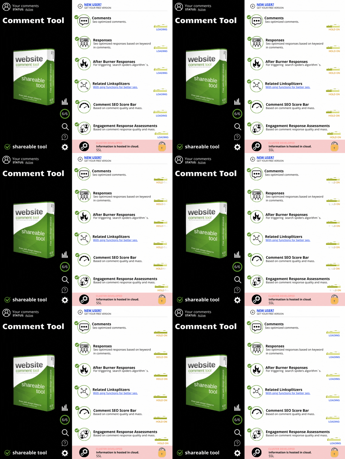
Summary:
What pervades the layout is building "trust" with the audience. That is absolutely the most important thing. In the next step, a number of breakpoints enter the Layout, breakpoints that are created for decisiveness and decision-making and which in this case consist of 2 buttons.
It is known that repeated information affects the audience more than non-repeated information. Based on this, the different sections of the layout are also made. Some are affected faster than others by information depending on a number of different factors. Based on this, the breakpoint sections are published in the Google Spreadsheet layout.
One of the reasons for how quickly the audience is influenced and how quickly they choose to make a decision is how hungry they are "for exactly what is served on the plate". That is, if you have what they are looking for and at the right price/conditions, then they will make a decision quickly to get what they want.
Creating trust is absolutely crucial to building a relationship with the audience. It is therefore especially important that the product, service is highlighted in a trust-inspiring way. A couple of ambiguities/mistakes in the layout are enough to lose the audience. So perfection in layout is critical to results.
A confidence-inspiring way that indirectly says that "we want to build a long-term relationship with our audience" and this is done by giving away a product, service (in the first place). You don't want to force the audience to use the script. Such a relationship would not last long. Audiences who want what's available are the right target group in this fictitious scenario!
A fair starting point which can mean that a new branch grows on the product owner's tree which can lead to a loyal customer in the long run. To create this situation, you first give away and then receive. In this fictitious scenario, a script that you retain control over and everything it includes. In this fictitious scenario, an increased number of users of the script will lead to increased traffic to the links found in the script. The links are so-called backlinks. Means increased traffic to landing pages that the links point to. Traffic gives us opportunities and the traffic comes via the audience that chose to use the script.
The value in this fictitious scenario is the script and the number of users. With the passage of time, the number of users will probably increase and thus also the traffic from the script.
New opportunities and openings come in parallel with increased traffic just as with an increased number of followers.
The description above is only fictional and should inspire you who are thinking about creating your own software and thinking about how a marketing layout could be made. From thought to action...
You don't need to be an expert in Photoshop, there are ready-made psd layouts on the internet that you can easily edit and put your personal touch on.
Now ask yourself the question, what kind of software do you want to create and what do you want the marketing layout to look like?
And what would be the purpose of your software? What problems will your software solve, what opportunities will the user get with your software, what target group is relevant for your software, how can you reach your target group, what competence is required of the person who chooses to use your software, what market price is relevant for your software, how quickly the audience can get your software and more.
Good luck with creating trust with your content.
Other articles:
- How to make a layout in Google Spreadsheet with associated automatically countdowns based on the break date/ time.
- Mit Hilfe von Ai-Design im Salzburg von der Idee zur Realität?
- Cross link between Youtube and Blogger an seo classic in Schaan?
- Different Metrics (Monaco) - Google Search Console V.S Bing Webmaster Tools
- Gray area publication in Florida and SEO results?
- The SEO power of the Joomla system in Switzerland is exceptional?
- Blog automation and analysis of competitors' content (Manchester)
- Hidden seo technique - Hidden keyword marketing (Frankfurt)
- Varningsklockor som du bör ha koll på vid sjukvård i hemmet.
- Hemtjänst, hur fungerar det i Höganäs?
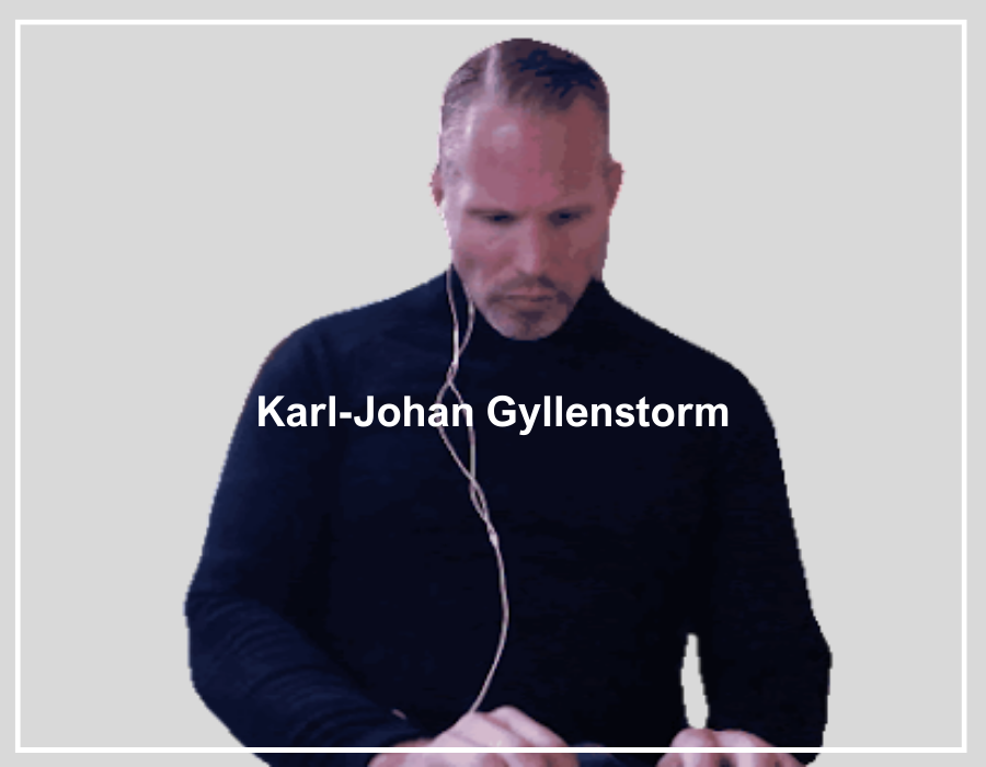
Karl-Johan Gyllenstorm is an SEO expert, marketing writer, he is certified in digital marketing by Google Digital Academy 2020. Karl-Johan is also known as “Gyllenstorm.”
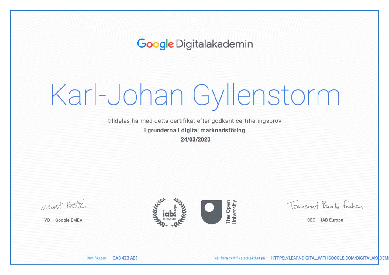
Karl-Johan Gyllenstorm was born in 1976 on June 21 in Mölle. Has knowledge in internet marketing with a focus on search engine optimization (SEO). He has expertise in online personal brand strategy and expansion, market analysis, affiliate marketing web automation, extravagant search engine optimization methods. Other relevant knowledge and university studies can be found in the subjects of data analysis and statistics as well as in radiology and image analysis. He got part of his breakthrough when he started his craft company in 2008. Karl-Johan has a patent for the name "Gyllenstorm". Karl-Johan Gyllenstorm has worked as a team base, project manager and site manager in previous professional activities. Gyllenstorm is one of the arms of the House of Knights.
Karl-Johan Gyllenstormś digital books.
Karl-Johan has over 16 years of experience in digital marketing.
The digital marketing journey started in 2008. Karl-Johanś first digital marketing project was a website for his painting business.The website was built in the Joomla system and dominated on relevant Top keywords in the painting industry. He now writes articles about marketing and search engine optimization in the Joomla system and shares his knowledge with the whole world.
Learn more about Karl-Johan Gyllenstorm.
Age: 48
Weight: 106 kg
Length: 188 cm
Shoe Size: 46
Hair color: Brown
Body type: Athletic
Instagram: gyllenstorm_kj
Twitter: gyllenstorm_kj
Medium: kgyllenstorm
Contact:
Main Menu

.
